Reimagined UPI Onboarding Flow optimized for maximum conversion
OVERVIEW
Finding the Missing Link in UPI Onboarding
The TWID journey hinges on a single transition: UPI onboarding. It sits between a successful login and the first real transaction, and it gates access to TWID’s core revenue streams bill payments and reward-based payments. Login was no longer the constraint. Onboarding was.
Only 51 percent of users completed it, creating a hard ceiling on first transactions, downstream usage, and revenue growth. Until this step worked, none of the monetization flows could scale.
PROBLEM SPACE
Feedback From CX Tickets
CX ticket analysis showed that ~10% of all support tickets were related to UPI onboarding. These issues consistently pointed to users being unable to complete setup, getting stuck in indefinite loading states, or not understanding why the process failed.
What the Data Revealed?
UPI onboarding plateaued at 59% completion, with drop-offs concentrated across three steps: SIM selection, SIM binding, and UPI linking.
While SIM selection contributed marginal attrition, the majority of failures occurred during SIM binding and UPI linking.
These drop-offs were not caused by lack of intent, but by a technically fragile flow that offered limited feedback, unclear failure states, and weak recovery paths, often leaving users stuck or misled.
RESEARCH
To build a solution, we explored the ecosystem & Existing solution deeply
We went back to first principles to understand where onboarding was breaking. We reviewed funnel data and CX tickets, then observed new users moving through the flow to get an unfiltered view of where friction surfaced. This helped us focus on root causes rather than treating surface-level symptoms.
To widen perspective, we also studied onboarding patterns across other apps in the UPI ecosystem. The contrast made the gaps in our own flow clearer.
Competitive Benchmarking Insights
Most UPI apps force SIM binding upfront; while strong API performance masks some friction, the experience still breaks easily during first use.
Activation nudges are either subtle or missing after onboarding, making contextual home-page prompts more effective than forced setup flows.
Loading states are largely full-screen and opaque, whereas preserving context during waits helps reduce anxiety and abandonment.
Failure communication across apps is generic and non-instructive, leaving users unsure how to recover from errors.
Apps rarely reassure users during verification or waiting, missing an opportunity to build calm and trust in sensitive moments.
Rewards are typically revealed only after success, leaving room to improve engagement by building anticipation during processing.
Insights from User Feedback and Data
The UPI onboarding flow felt long, over-explanatory, and disconnected from the core app, making users feel passive and helpless during a critical step.
Most drop-offs happened during SIM binding, where long, generic loaders and background checks gave users no reason to stay engaged.
When failures occurred, the UI did not explain what went wrong, pushing users toward blind retries that frequently resulted in three-attempt lockouts.
Nearly seven percent of failures were caused by backend issues, highlighting structural fragility rather than user error.
UPI linking showed inflated “0 accounts found” cases because the interface allowed accidental progression through unintended taps.
Across the funnel, user intent was strong, but the system failed to support it with clear feedback, shorter waits, and interaction cues that kept users anchored.
OBJECTIVE
Make UPI onboarding clear, fast, and resilient
Improve UPI onboarding success by reducing ambiguity, surfacing rewards early, and preventing failure through clear feedback, actionable errors, and retry guardrails.
IMPACT
What it meant for users?
Reduced time spent in silent or indefinite loading states
Clearer error messages that explained what went wrong and how to recover
Fewer accidental SIM binding failures caused by leaving the app
Safer retry behavior that prevented unnecessary lockouts
A faster, more predictable onboarding experience with clearer progress cues
What it meant for business?
Lower drop-offs during onboarding, reducing early user churn
Improved conversion through a critical acquisition funnel
Reduced acquisition waste from users who never complete setup
Lower retention and support costs driven by fewer onboarding failures
A healthier onboarding funnel that feeds long-term engagement and revenue flows
FINAL SOLUTION
1. Reduce Anxiety Caused by Isolated Long Onboarding Flows
We transformed the longest and most fragile step into a predictable, guided experience where users understand what’s happening and feel safe waiting.
What changed:
We removed the standalone onboarding screen. It was pulling users out of their task and asking them to learn before they could act. The pitch came too early. The cost was attention.
UPI onboarding was broken into modules. Entry points now live where intent exists. If a user tries to pay via UPI or BBPS, onboarding starts there. No detours. No pre-commitment.
We shifted onboarding into a bottom sheet. The payment context stays visible. The user stays oriented. Progress happens without a full-screen takeover.
2. Reduce Perceived Waiting During UPI Onboarding
Introduced progressive bars to show step-level completion and forward movement.
Removed generic loading spinners that provided no status or reassurance.
Added clear, contextual information at each step of the UPI onboarding flow to explain what was happening and why.
3. Redesigning the Bank Listing Page
The Bank Listing page was redesigned around real user distribution.
High-usage banks were surfaced first in a grid to speed up recognition and selection, followed by a list view for long-tail banks.
Search was added to let users directly find their bank instead of scrolling through the entire list.

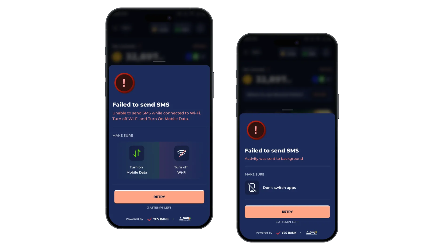
4. Redesigning the Failure State
UPI linking failures were redesigned from scratch. Instead of a generic “Try again,” the system now shows the failure reason “Wifi is On, Failed to send SMS, App is Switched“. Each reason is shown clearly. Also mentioned visually very common precautions which user should be aware about (Wifi Off, No App Switching, Active SMS Plan and Active Mobile Data)
The UI stops pushing blind retries. It slows the user down on purpose. Read the error. Fix the cause. Then continue.
We added guardrails around retries. After three failed attempts, the system locks UPI onboarding for 24 hours. This restriction is now communicated before the user hits Retry. No surprises. No accidental lockouts.
The goal was simple. Reduce panic. Prevent irreversible mistakes. Replace trial-and-error with informed action.
Make Onboarding Visible on Home Instead of Hidden Away
UPI onboarding was moved to the Home screen. No hiding it behind secondary flows.
For first-time users, we surface the reward upfront. Create a UPI ID. Earn immediately. The value exchange is explicit before commitment.
For returning users who have already claimed the onboarding reward, the message changes. The surface now highlights the core proposition. Earn 5% TWID Stars on every UPI payment.
The intent was simple. Remove guesswork. Show the reward before the action. Make UPI ID creation feel worth starting.
